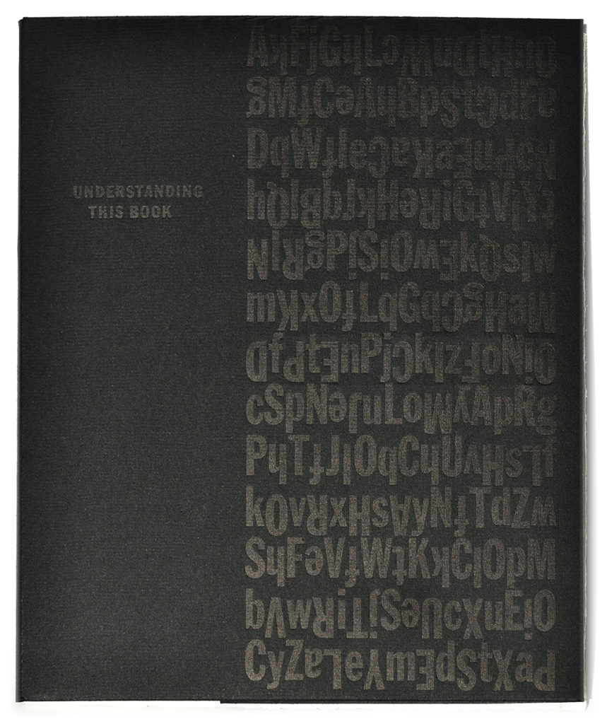
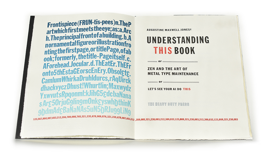
Understanding This Book
or Zen and the Art of Metal Type Maintenance
or Let’s See Your AI Do THIS
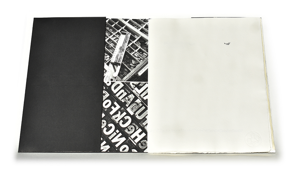
28 x 23 cm, 20 pages. All sorts of antique Franklin Gothics printed in four colors with Spiffy the Vandercook on Hahnemuhle Biblio, Ingres, and Bugra (jacket) paper. Bound by hand with a simple pamphlet stitch into a Hahnemuhle Photo Rag cover, giclee printed with photographs documenting the process, tucked into a rigid Bugra jacket. Limited edition of 18 signed and numbered copies. ISBN 979-8-9893902-0-5
Five copies remain for sale.
Libraries in which you may experience a copy of Understanding This Book
Fleet Library Rhode Island School of Design, Providence, RI
Golda Meir Library Special Collections, UW-Milwaukee, WI
Kohler Art Library Special Collections, UW-Madison, WI
Moody Memorial Library Baylor University, Waco, TX
Murphy Library Special Collections, UW-LaCrosse, WI
Rare Book & Manuscript Library Columbia University, New York, NY
University Libraries Special Collections, Washington University, St. Louis, MO
Weston(Bodliean) Library University of Oxford, England
Dealers through which you may purchase a copy of Understanding This Book
The Kelmscott Bookshop Rare Books Savage, MD
Long Story Short
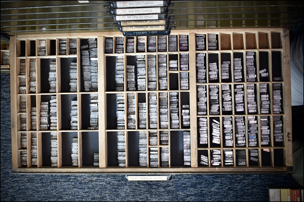
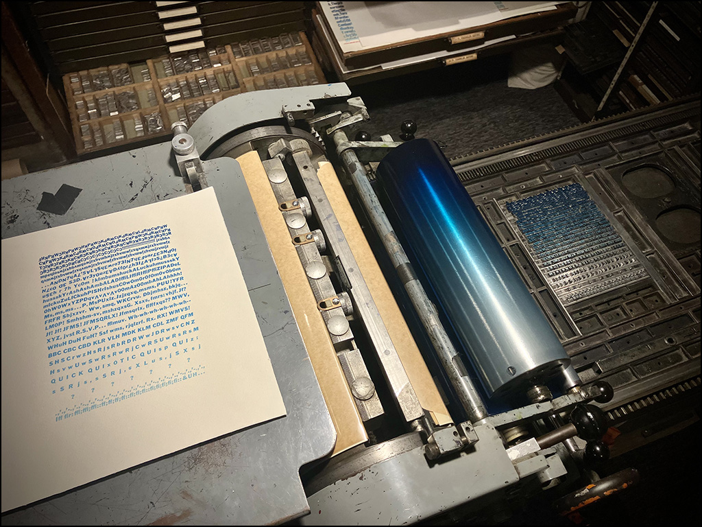
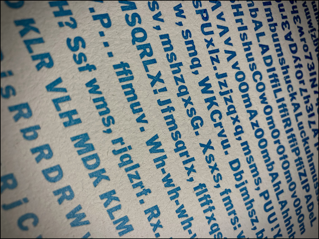
When all my drawers of Franklin Gothic type needed to be cleaned, the mundane but necessary shop maintenance task turned into a book about the process. The result is a 20-page book featuring every last sort from nine California job cases of genuine ATF Franklin Gothic typefaces—maybe not older than the hills, but definitely older than me—in varying stages of wear, arranged according to a variety of strategies only likely to occur when composing individual metal types by hand.


The final product of this very spontaneous and time-crunched project is a bold book conveying the frantic experience of creating it, while celebrating Franklin Gothic in a typographically jazzy manner.
Long Story Long
Self-employment as a carver of grave stones depends upon outside temps above 45°F, which is about eight months of the year here in southwest Wisconsin. This leaves the winter months available for creative projects in the Klubhaus.
This past winter (2022-23), I had planned to use some of the precious time to create a couple new broadsides. I had just finished the 8t Bags book in time for the Oxford Fine Press Book Fair in March 2022, and the thought of pumping out a few relatively quick and easy broadsides felt like a pleasant thing to do. The next Oxford Fine Press Book Fair, which is a self-imposed deadline for the completion of book projects, would be held in March of 2024 (or so it had been assumed), so there was no real urgency to get started on the next book.
After consulting the short list of potential broadside content, a Cougar Awareness broadside rose to the top of the list: protocol for action in the event of engagement with a cougar. As serious as the matter may be, I found it amusing, and after a string of broadsides with a fairly somber tone, having a little fun creating something more light hearted had tremendous appeal.
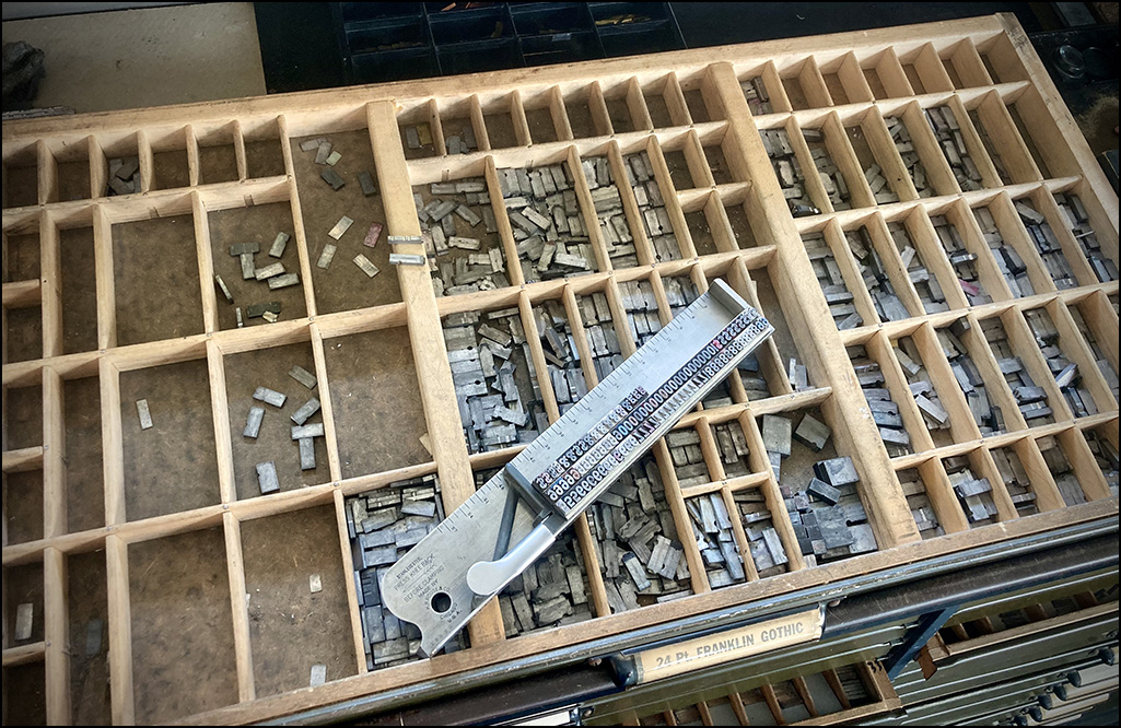
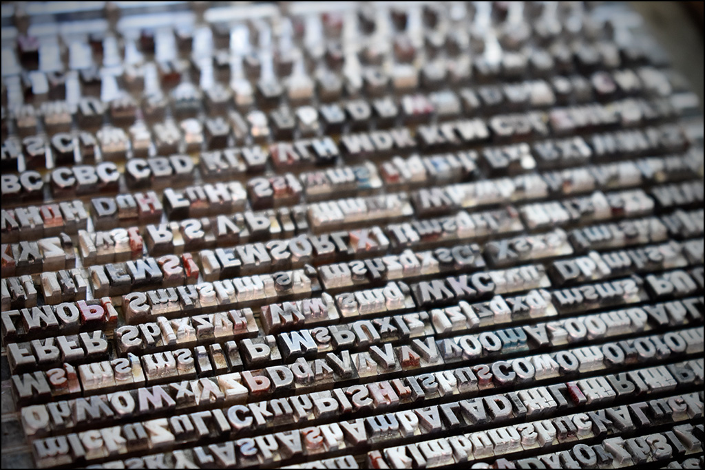
All previous broadsides had been set in the Roman typefaces from my limited inventory, and this change in tone called for something less formal. There are not many typefaces to choose from in the Klubhaus, and when I looked over the bank of type the Franklin Gothics stood out against all the others. These nine California job cases of 10, 14, 18, 24, and 36 pt Condensed and Italic fonts had been with me for nearly thirty years, and have never been properly featured in any book or broadside. They were acquired with the purchase of a letterpress shop from a retired commercial printer a few years after graduation from college, and have always been deemed too dirty and disorderly to use. Maybe even too worn to print well enough to produce anything of value. Still, they are as classic as they come when we think about American gothic typefaces, and in my humble estimation one of Morris Fuller Benton’s most important contributions to typography. For those reasons, they were never dumped to make room for fresh type (which can be expensive and inferior to good, hard foundry type), but rather saved to be cleaned up some time down the road. This felt like a good opportunity to put them to use, and clean them up a little bit in the process.
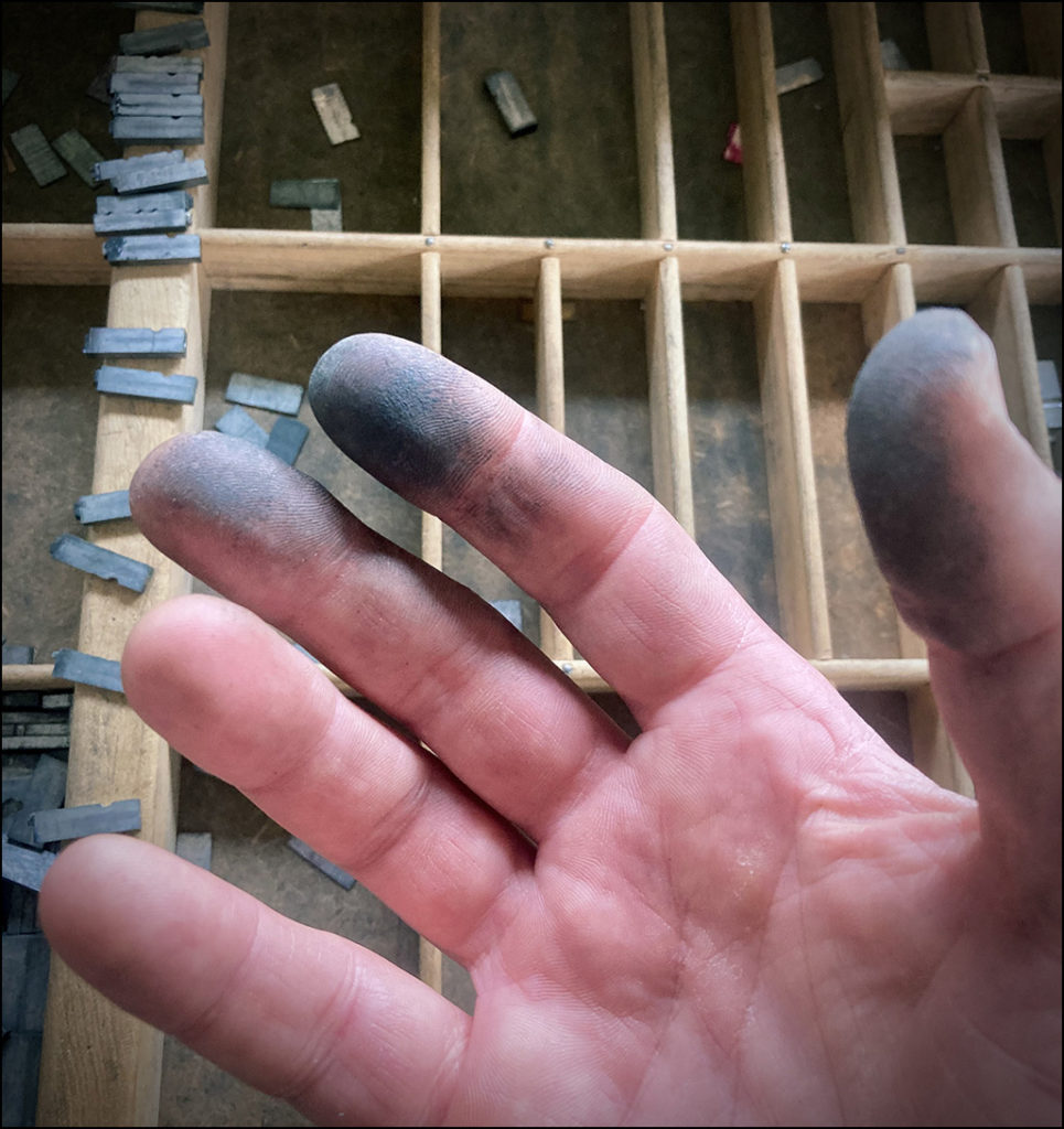
Setting no more than five lines of the 10 pt revealed how impossibly dirty they were; intolerably dirty. My fingertips had become coated in a measurable thickness of grime, and the more I had to dig into each little compartment, the more disgustingly apparent it became that there were only two options: pick a different typeface for this project and start over, or put the Cougars broadside on hold for a bit, and get down to the business of thoroughly cleaning all the type, and enjoy much more pleasant, annoyance-free typesetting of the Cougars broadside, and every other job that calls for the 10 pt Franklin Gothic Condensed in the future.
Mundane tedium is my thing. There is great satisfaction in completing a task which feels massively daunting at the onset, when the only real challenge is committing to take the time to follow it through to the end. I have been patiently working towards creating the tidy letterpress studio of my dreams since the day I bought this type in 1995, and meeting this challenge would be a major step in that direction. The desire to see this job through overtook me.
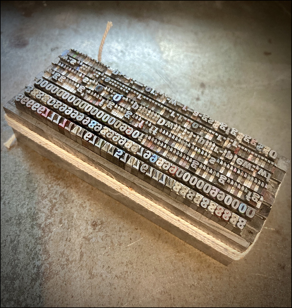
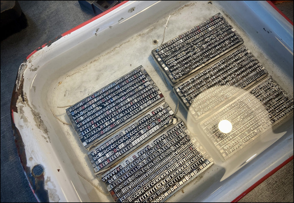
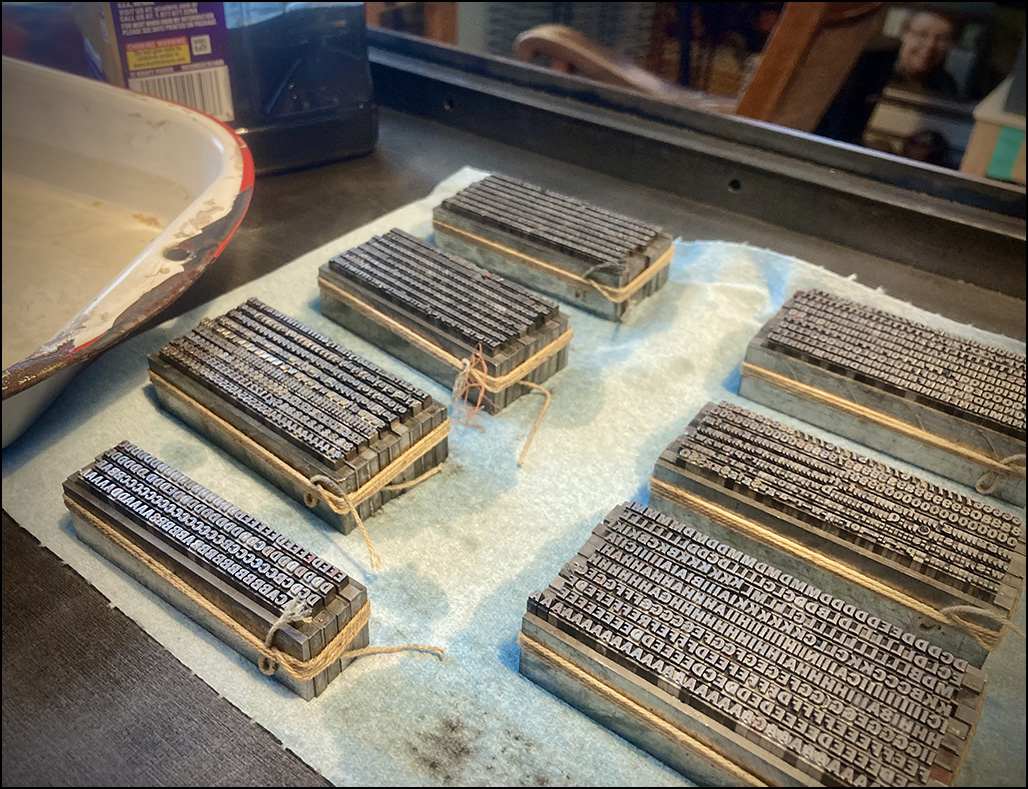
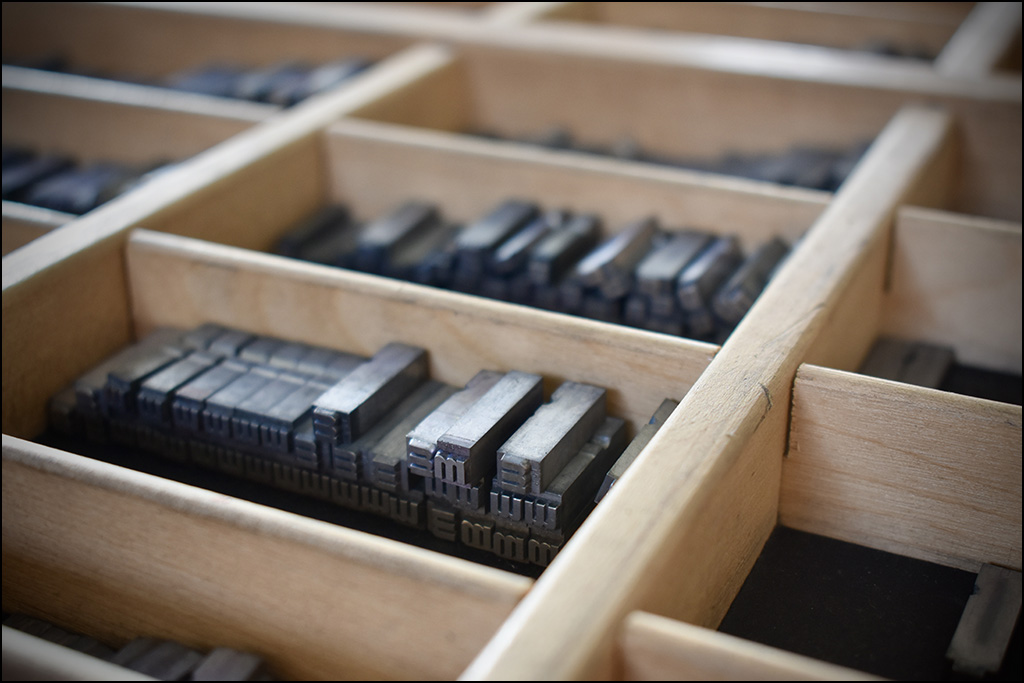
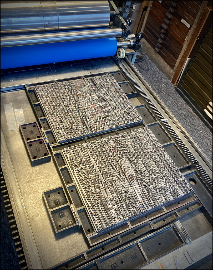
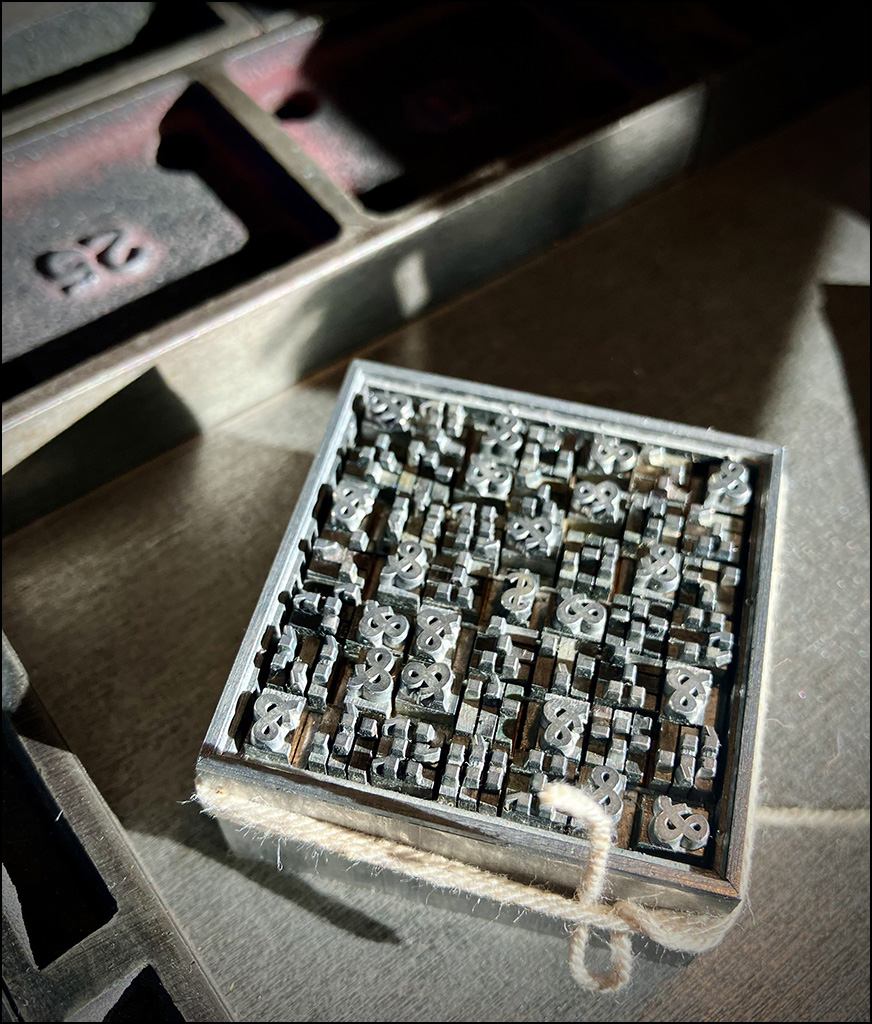
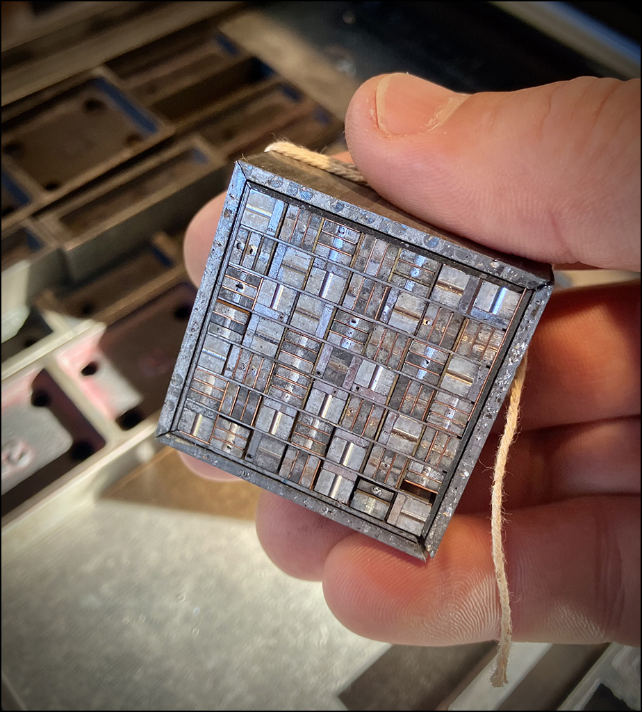
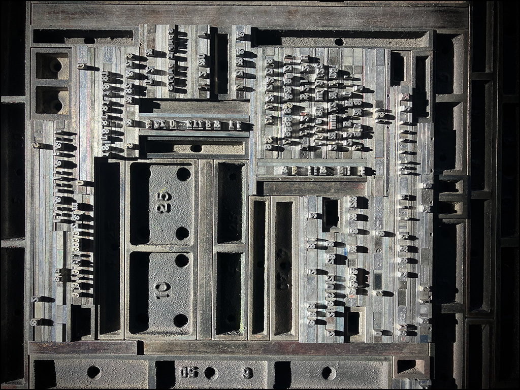
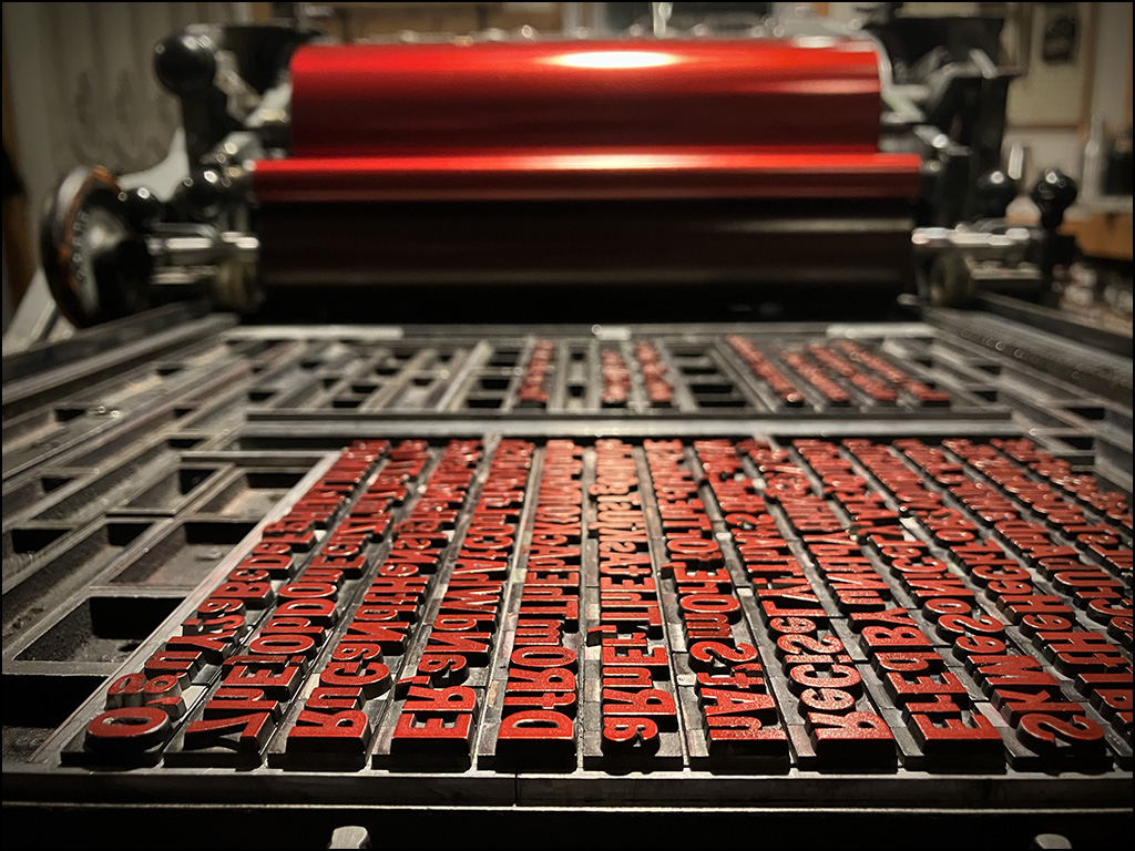
The procedure for cleaning the type may have been crude, but it got the job done: begin in the upper right hand corner of the case, and methodically stand up every sort, one compartment at a time, in 20 pica lines with 2 pt leading. Once they were all standing up, tied blocks of type were submerged in a solvent overnight, removed to drain on shop rags in the bed of the press, and had their faces scrubbed. They were then untied and lined up against the side of the bed to have their bodies wiped clean, front and back, one line at a time, and returned to the galley for proofing later. After proofing, they would be redistributed neatly into their case, vacuumed and lined with black mat board.
After the lengthy ordeal of cleaning up the 10 pt Franklin Gothic Condensed, it was only natural to have thoughts about how long it would take to clean up the remaining eight drawers, which would result in having ALL of my type clean and orderly, for the first time since The Heavy Duty Press was established in 1995. And yes, those thoughts ultimately led to the decision to proceed, because the ball was already rolling, so to speak. It was finally time to tackle the task.
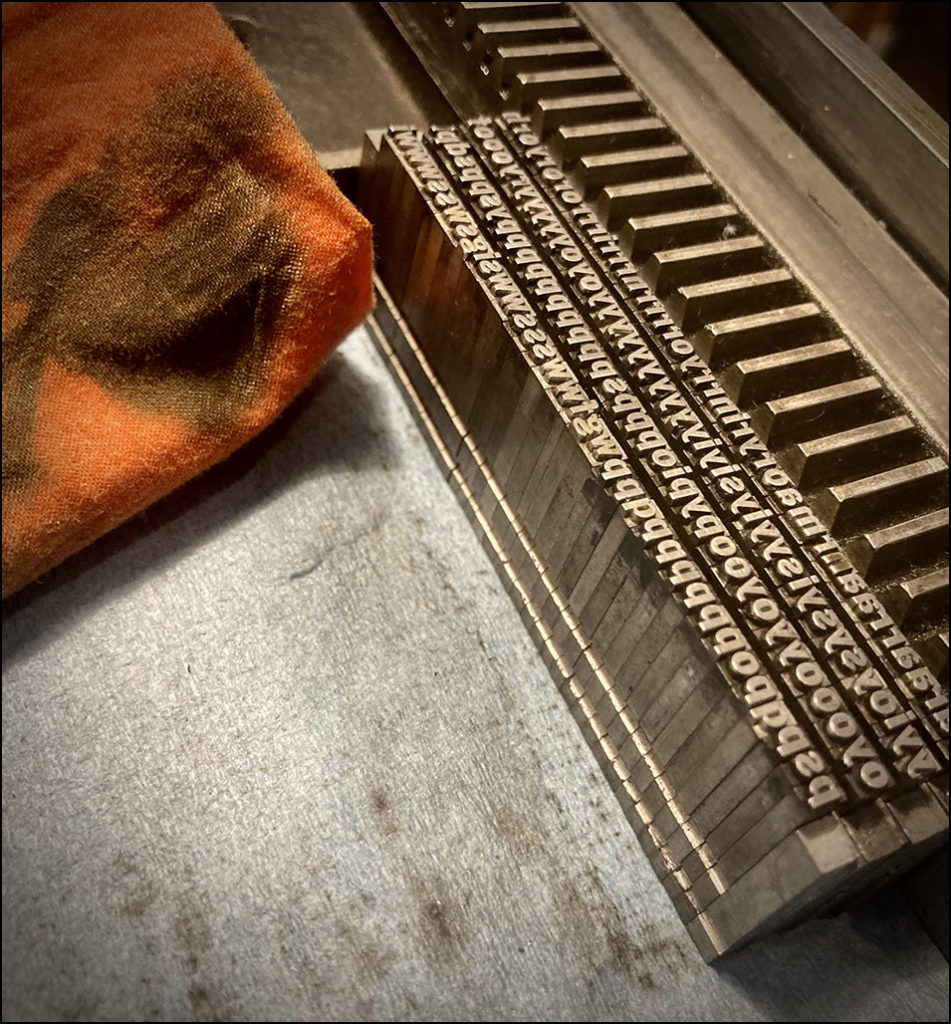
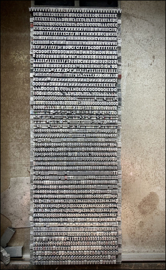
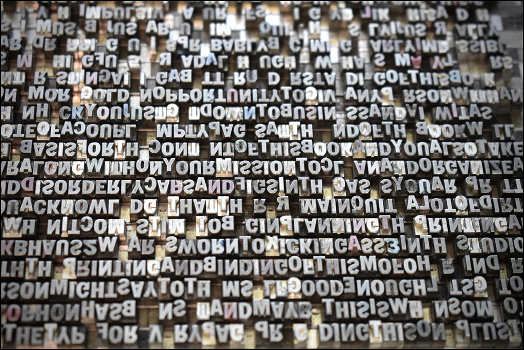
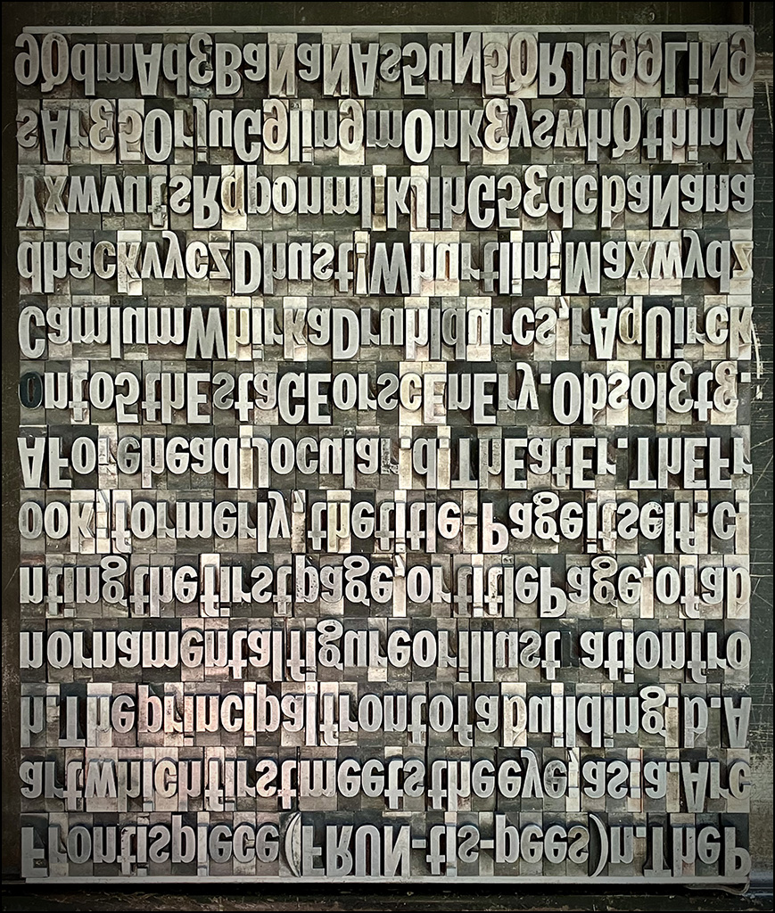
The remainder of the Franklin Gothics were not nearly as filthy as the 10 pt, and therefore needed only to be stood up on their feet and given a thorough face washing. First up, as a reprieve from the tiny 10 pt project, came the 24 pt. These larger sorts were set on 45 pica lines and stacked up in the bed of the press, where they would be easy to clean, until there were two columns full of characters, standing shoulder-to-shoulder. And that is when the tedious and mundane task of cleaning not just one, but nine drawers of disregarded and dirty old type sparked the idea that led to Understanding This Book.
The sight of two 45-pica-wide columns of the entire contents of that old drawer of type standing in the bed of the press looked so much like it was waiting to become a page spread that, once again, it stopped me to think. And after maybe five or ten minutes of private deliberation, a decision needed to be made. Make a book about the process of emptying out these nine drawers, cleaning all the type, and returning it tidily to clean cases while in the process of doing it: yes or no?
Yes. Turning this task into a book would accomplish a two things: it could transform an unplanned, time consuming, and boring task into something fun, and it would be an opportunity to reprise Augustine Maxwell Jones, the author of Alchemy (2002). And in doing these two things, it would add a fun impromptu title to the Heavy Duty Bibliography. Decision made.
And then it got just a little more exciting. Shortly after committing to the project, an email arrived in late February, announcing the next Oxford Fine Press Book Fair, to be held on 9-10 December 2023, nearly four months sooner than expected. This news left about two months (March and November) to complete something to show at the fair. With nothing else started and the clock ticking, Understanding This Book would have to accomplish one more thing: it would have to become the featured title from The Heavy Duty Press at the next fair in December, and it would have to become that in pretty short order.
The remainder of the 2022-23 creative “off season” was spent selecting paper, designing the book, building a prototype, standing up all of the 18 and 24 pt Franklin Gothic Condensed and Italic, and printing them as a background for the center spread folio. The rest would have to wait until November.
Thanks to fair weather this fall, it was possible to jump back into this project in early November. Estimates for how long it might take to set the remainder of the type for Understanding This Book were roughly 33% short of reality. Even so, every last sort of Franklin Gothic Condensed and Italic in the Klubhaus was set on its feet in frenzied fashion by mid-November—some as stream-of-conscious on-the-stick composition, some a la dada (as in random), some guided by patterns, and sometimes all three of those things! It was fun, even if it was a somewhat stressful race against the clock. Ideally, all of that comes through in the final product.

With three weeks to go before departure to Oxford, all nine California job cases were finally completely empty, and for the first time, a few days before beginning to print, I had full knowledge of exactly how much content needed to fit into the space available. As we say in the Klubhaus, books design themselves, and art is the arrangement of things in a space. The process of cleaning and printing all my Franklin Gothic provided the content, and it had finally come time to arrange that content in the space available.
After all the drama of setting the type, getting down to the final arrangement, cleaning, and printing of every last sort of Franklin Gothic in the Klubhaus posed new challenges. Is this ink the right color? Where does this fit? Why should that go there? Well, if not there, then where does it go? The six-day printing schedule required a fine balance between patient contemplation and industrious hustle. Along the way, new ideas kept coming, requiring eleventh-hour (or early hour?) rearrangements of the type almost every morning before printing, which is a challenge to one’s patience. But isn’t that our calling card, as fine press printers? Aren’t we either by nature or nurture an unusually patient lot? We are, and it is a trait to embrace, for each time we exercise patience in printing, we are rewarded with the sight of something a little bit closer to perfection.
It is remarkable, sometimes, the role time can play in the development of a book’s content and design. It just makes a person feel like it is a good thing that these projects stretch out over time; that there truly is virtue in patience and perseverance; in remaining calm and taking the necessary time required to do the things that need to be done. Everything seems to come together just as it should in the end.


Less than a year ago, I was stopped in my tracks when I acknowledged a need to take care of my equipment. With a shrug and a sigh, I dropped everything to get the job done. Scheming that I might be able to get paid for the precious time it would take to complete the job, the tedious task was made fun and documented in Understanding This Book. The final product of this very spontaneous and time-crunched project is a bold book conveying the frantic experience of creating it, while celebrating Franklin Gothic in a typographically jazzy manner.
I do wonder if the book could have been better if I had twice as much time to make it. Probably. Twice as good? Maybe. Did I have the time? No. But what is most important is that the job is done, and nine drawers of freshly cleaned type are ready for future projects. Secondly, fast-moving and experimental projects like this are an opportunity to gain valuable printing experience that may be applied to future projects. And as an added bonus, there is a new book from The Heavy Duty Press, sharing a story that might entertain its audience and help fund the next project.