Native Son at Home, by David Steingass
Five Guidebook Sections from
GreatPlains: A Prairie Lovesong
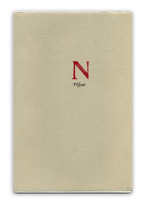
The book is 52 pages made from 3 colors of Hahnemuhle Ingres paper, printed with 5 colors of ink. The type is entirely hand set fresh 10 pt Century Oldstyle, News Gothic, and News Gothic Extra Condensed.[1] The design features handsome asymmetrical antique ornamentation throughout, with 10 illustrations by Michael Koppa, printed from magnesium engravings. The pages are bound by hand, on exposed “tapes” made from repurposed production proofs. The jacket is Nideggen, rubber stamped and numbered on the front cover, with a hand lettered spine. Signed and numbered limited edition of 100 copies.
$300


A Note on the Type
Superfluous to note to some, but worth telling:
I had originally signed a contract with David Steingass to print the entire Greatplains saga, a 52-page poem, if I remember correctly. The intention was to set the book on a Linotype Model 5 Comet I had recently purchased from Philo Baker at Jackson Printing in the Milwaukee ghetto. For those who don’t know, a Linotype machine casts full lines of type by injecting hot lead into a mold of brass matrices. The machines are incredible to watch, fun to operate, and much more efficient than setting type one letter at a time. They are also incredibly outdated. One poem into the setting of the book, and I found myself with a burnt out element in the melting pot. The price to have someone come fix my “new” Linotype would have been in excess of $500. Not a lot of money? It was to me. I bought the machine for $500.
The breakdown forced me to do some research, and I learned about a preference for the aesthetic of hand set type in fine press books. I already knew that I enjoyed hand setting type. In fact, I preferred it for the silence and meditative nature of it. So I explored further. I learned the foundry type cast by the American Type Founders Co. in New Jersey, founded in part by La Crosse, Wisconsin, native Linn Boyd Benton, produced the highest quality type available. The Barth casting machines at ATF produced type made of especially hard metal, due to a higher antimony content than other lead types, which makes them more durable, i.e. more suitable for setting, printing, redistributing, setting again, etc. without wearing out. This, in turn, led me to Fritz Klinke at NA Graphics in Silverton, Colorado. Fritz purchased the entire remaining inventory of type at the auction upon the bankruptcy of the American Type Founders Co. in 1993. Outside of custom casting by Theo Rehak, then of The Dale Guild in Howell, New Jersey, which would have been insanely expensive, there was no other way to acquire fresh ATF type in the quantity I needed to set David’s book.
The number of fonts of metal type needed to set a book is based on the number or lowercase a’s. For example, one font (package) of 10 pt Century Oldstyle might include 20 lowercase a’s. If there are 400 lowercase a’s in the manuscript, 20 fonts of type will be needed to set the entire manuscript. In the case of this project, there were probably about 4,000 lowercase in the Greatplains saga. When I informed David of my dilemma, we agreed to change the scope of the project to include just the six “guidebook” sections of the original manuscript.
I requested a catalog from NA Graphics and found 33 fonts of 10 pt. Century Oldstyle lowercase type available, with enough uppercase and figure fonts available to fill out a California Job Case (and then some). So I bought it all, for something like $1,200, thereby using the last remaining type available, in the quantity and of the quality required, to set a book of poems, and establish this press, which, as you may read for yourself, turned out to be quite fitting.
I called a scrap dealer to come take away the Linotype, which maybe is at the bottom of Lake Michigan somewhere, and that 10 pt. Century Oldstyle will be the the work horse of The Heavy Duty Press for many years to come, as long as there are books to print.