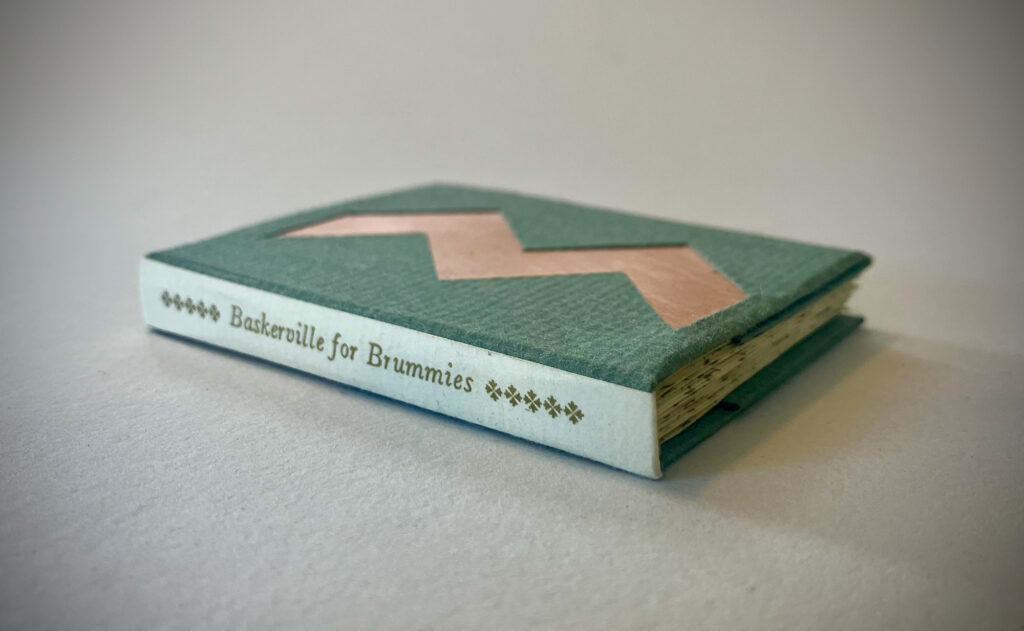
Baskerville for Brummies
Selected Neighborhoods and 33 Artists of Note
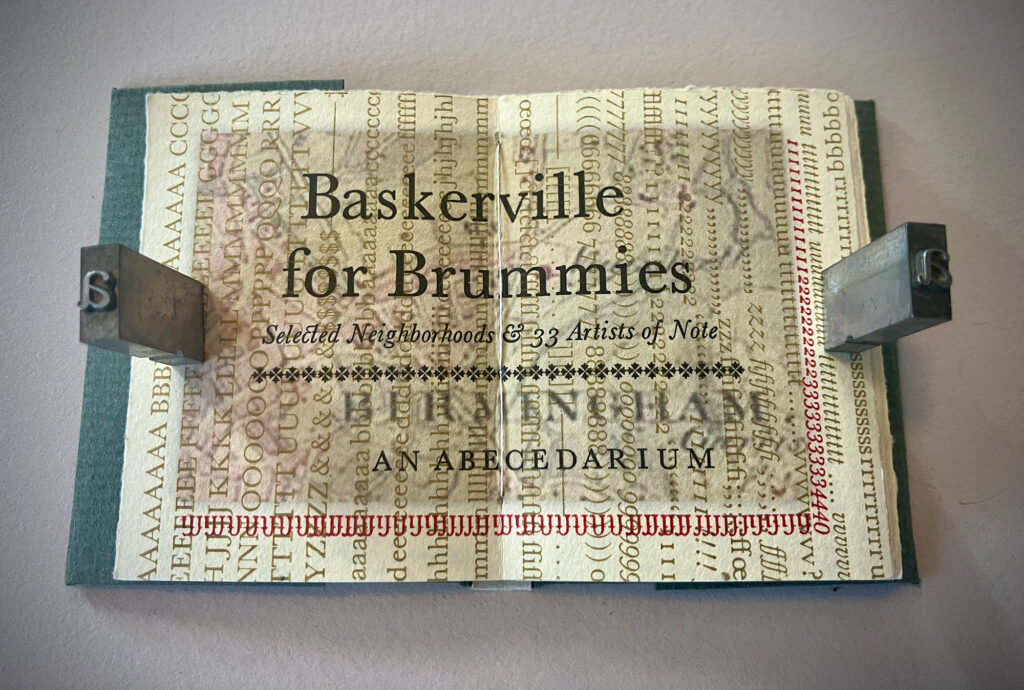
AN ABECEDARIUM FOR BIRMINGHAM
48 pages, 6.7 x 5.1 x 1 cm; 8, 10 and 30 pt Baskerville Roman and Italic, letterpress printed with the Vandercook in gold, black and red ink on Zerkall Frankfurt Cream; title page background, full color reproduction of John Baskerville portrait (painted by John Millar), and 26 text block backgrounds (sections from 18th century map of Birmingham) inkjet printed with a Canon Pixma iP4500; hand bound and cased in covers made of copper plates wrapped with Hahnemuhle Bugra paper and letterpress printed spine in gold ink on Zerkall Frankfurt Cream. Limited edition of 22 copies. 979-8-9893902-4-3
This miniature book is an unsolicited creation for the people of Birmingham, England, as they commemorate the life of John Baskerville (1706-1775), marking 250 years since his passing. To be perfectly honest, it was news to me until I began searching for any book-related things to do in England after being accepted to the PAGES Artists’ Book Fair in Leeds. Upon learning about the Baskerville projects being undertaken by the University of Birmingham and Cambridge University to celebrate John Baskerville’s contributions to typography and printing, it seemed the obvious thing to do would be to create a book featuring Baskerville’s famous typeface.
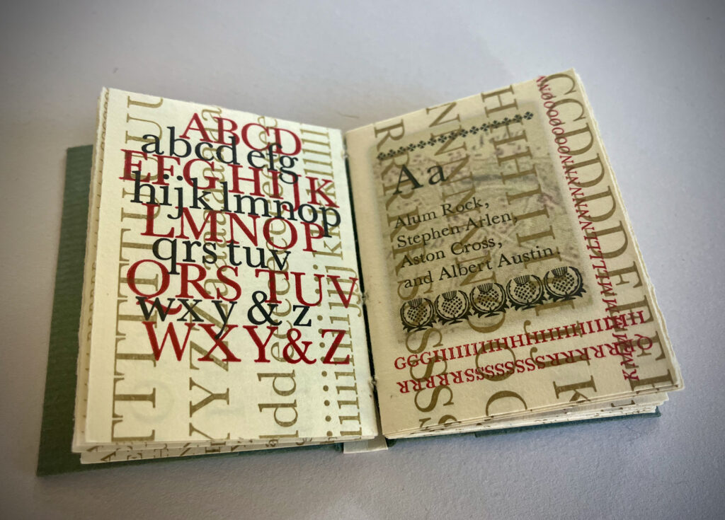
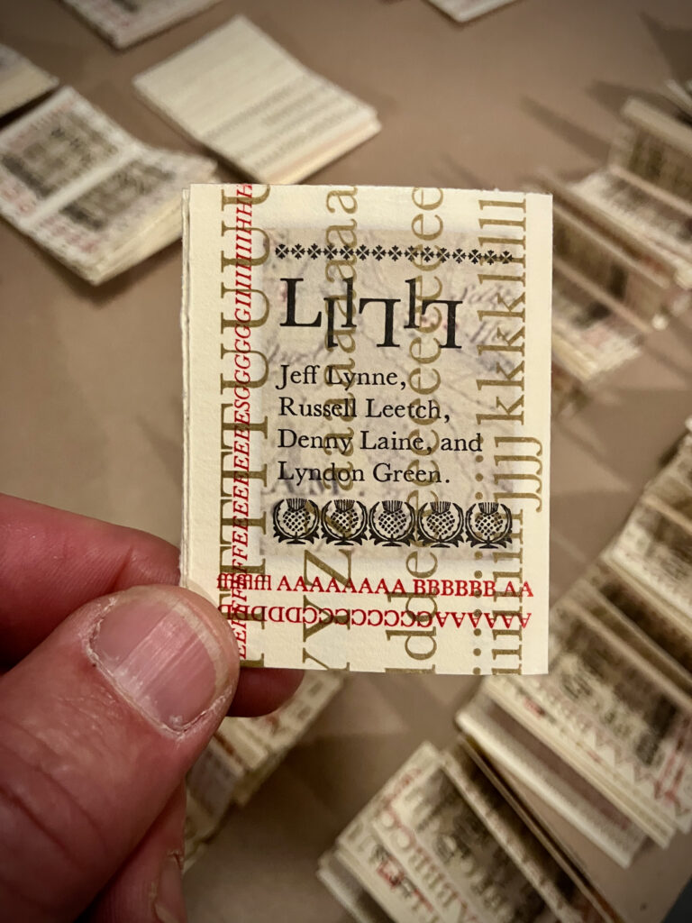
After purchasing a used font of 30 pt Baskerville Roman from Michael Moore and freshly cast fonts of 8 and 10 pt Roman and Italic from Ed Rayher at the Swamp Press, the next thing to do was decide what to make with the type. Given I had only about a month (or less) to pull it off, the book needed to be small, and what better type of book to celebrate a typeface than an abecedarium? And what else to put in this abecedarium but Birmingham-related things?
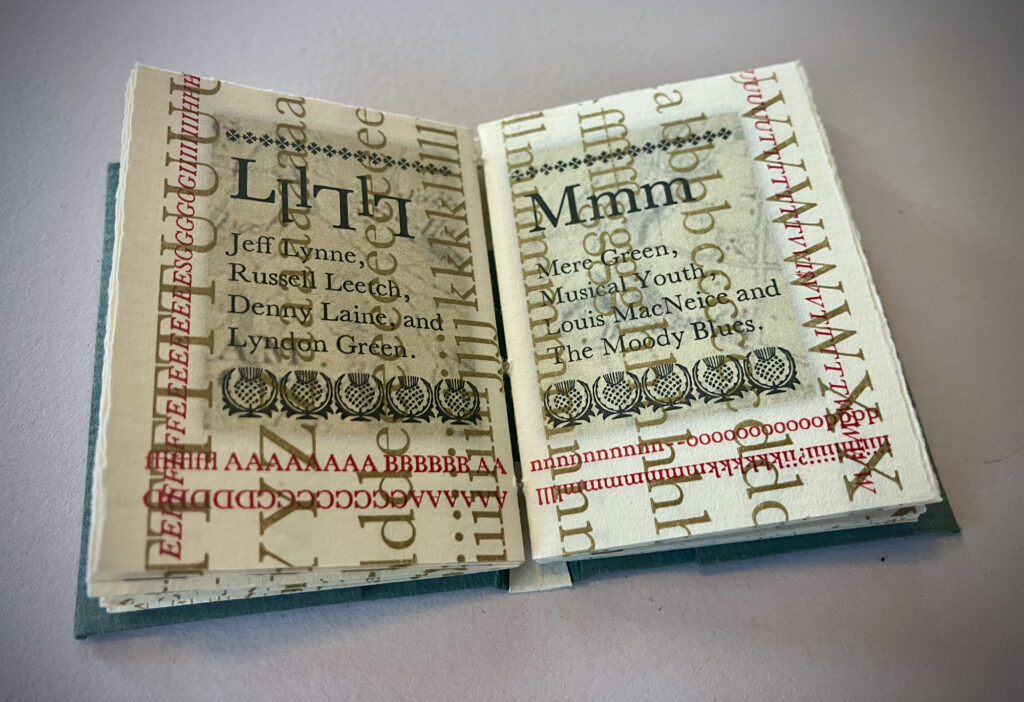
After a fair amount of bedtime research about Birmingham (and learning a lot of interesting things), it seemed the best chance for something complete and slightly poetic would be a list of neighborhoods, all of which have excellent names (as far as a man from Wisconsin with a life long fascination with England is concerned), along with names of famous (or semi-famous, at least) artists and (mostly) musicians from Birmingham.
The Creation
The frantic pace of this book’s production was reminiscent of that two years ago when creating Understanding This Book for Oxford in December 2023, yet that was never acknowledged until it was nearly finished. It is remarkable, given that I was taught the thing you ought not be when making books is in a hurry. This may be true in the best scenarios, but with these two books I learned I have learned how to work swiftly, and I enjoy the improvisational nature of the process dictated by urgent timelines. It proves that if you just get down the business the art creates itself.
In the case of Understanding This Book, I had to react to news of the Oxford Fine Press Book Fair being scheduled four months before I had anticipated, and therefore had just one month to complete the book I intended to show and sell at the fair. In this case, the late-coming decision to attend the PAGES Artists’ Book Fair in Leeds led to the desire to create a book to commemorate John Baskerville’s contribution to typography before visiting Birmingham, which spawned a fresh idea to be executed in just three weeks.
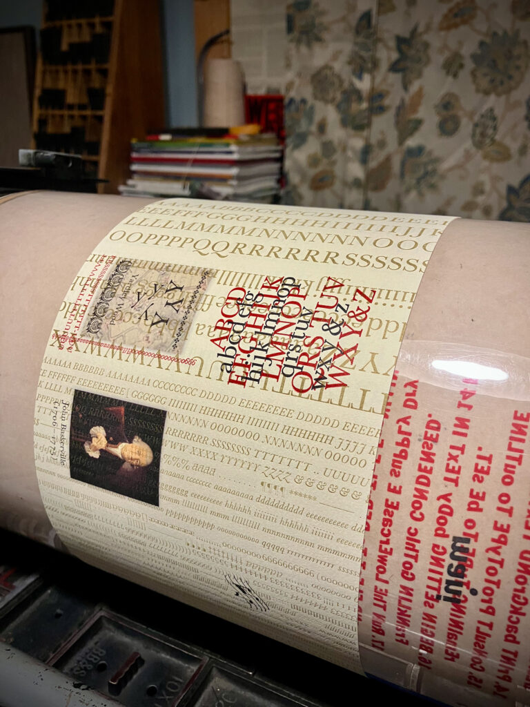
Not only the pace of creation, but the design of the book followed a similar aesthetic: type specimens as textural backgrounds to the primary content printed over it. This is how learning from experience works; continuous improvement, ideally. A few things changed, and perhaps they are not necessarily improvements, but they are notably different. One, the type is freshly cast, new type, rather than scrubbed up dirty old type that had seen decades of use in a commercial print shop. Two, the texture is a delicate Roman typeface, designed by an Englishman in the 18th century, versus the bold sans serif in Understanding This Book—Franklin Gothic—designed by an American 150 years later. Three, the texture type in the background runs vertically on the page, and bleeds off the top and bottom (but not over the fore edge or across the gutters).
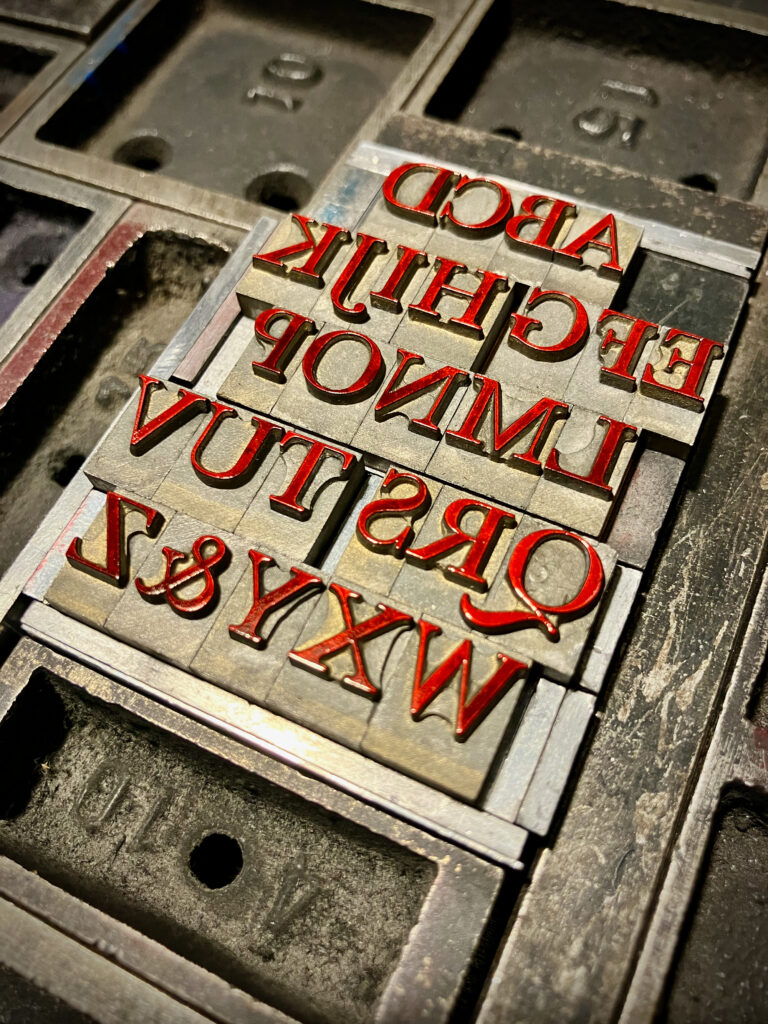
Color. Understanding This Book celebrated the contribution of a quintessentially American sans serif to the typographic world by Morris Fuller Benton. The red, white, and blue inks chosen were intended to reflect that. Looking at the highly esteemed books created by John Baskerville in the mid 17th century inspired the use of gold* ink for the background texture in this book, and with black and red ink over the top, the pages are designed to appear more dignified.
* After a visit to the Cadbury Research Library on 20 March, I’m not sure exactly why looking at images of Baskerville’s books would have led to the use of the gold ink; he never used any gold ink. Perhaps it seemed to me that his books were, in some minds, the gold standard in typography in his time (which apparently to many they were not). Regardless, the gold seems appropriate. Perhaps he would have used gold ink if he could have. He simply printed with the richest black.
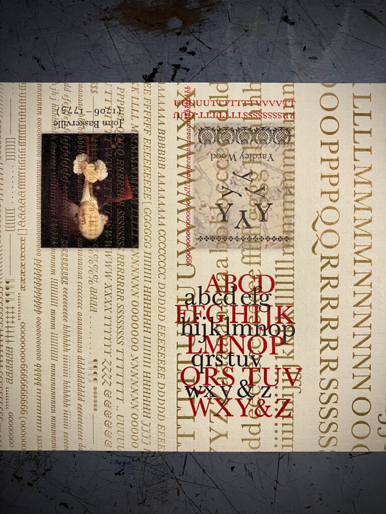
The introduction of inkjet printing to assist in illustrating this book came as surprise midway through production. After recognizing a need to create some kind of additional field of color over the gold type specimens (because the tiny black type that is the primary content was going to need it), and not really prepared to attempt printing transparent color fields with the Vandercook, it came to me upon waking one morning that I might get the effect I wanted with the inkjet printer attached to my computer. A simple trial proved it would not only produce satisfactory transparent colors, but those colors could be images, those images could be sections of an 18th century map of Birmingham (neighborhoods), and I could also print a full color reproduction of John Millar’s classic portrait of John Baskerville. Merging printing technologies that are centuries apart is liberating.
Size matters: Dictated in part by the freshly cast 10 pt Baskerville, and partly by the requirement to make something quick with the paper inventoried, and also partly by the recognition that I have yet to make a truly miniature book, this book is tiny.
The Cover Design
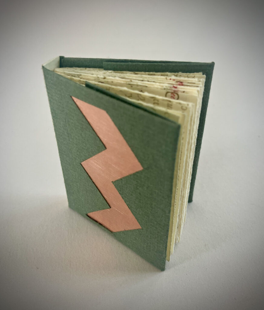
The evolution of this simple cover design has now spanned three titles, beginning with 8t Bags about the Natural World (2022). Of a similar size, the cover for 8t Bags was designed to be light weight and adhesive free, and a single sheet of Hahnemuhle Bugra served well. Understanding This Book featured a cover following the same pattern at a much larger size to house much heavier paper. When it was found to be too flimsy, simply inserting a thin piece of chip board stiffened it nicely. Binding the prototype for Baskerville for Brummies revealed the weight of the tiny pages bound in 3-folio signatures was a little heavy to lay perfectly flat. This could be resolved with weighted covers. Conveniently, the most recent title, Hail, Holy Queen, featured .22 gauge copper covers, there happened to be enough surplus copper on hand to create ten covers, and Birmingham happens to be a major player in the copper industry, currently and historically. Serendipity, cosmic magic, whatever the case, a welcome coincidence.
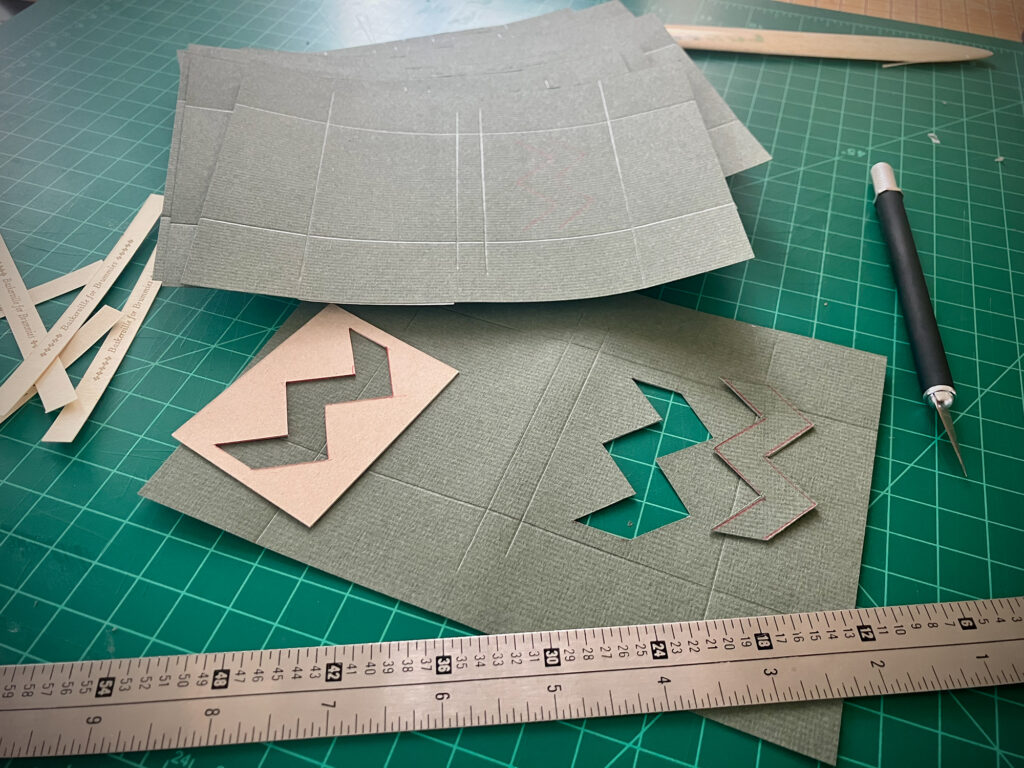
If it the covers needed to be weighted, and the weight in the cover had some significance to Birmingham, then certainly it ought to be revealed what the weight is. The zig zag cut out of the cover to reveal the copper within is taken from the flag of Birmingham, representing both the letter B (for Birmingham, or maybe Baskerville, and Brummie), and the letter M, representing Birmingham’s epithet, “City of a Thousand Trades.”
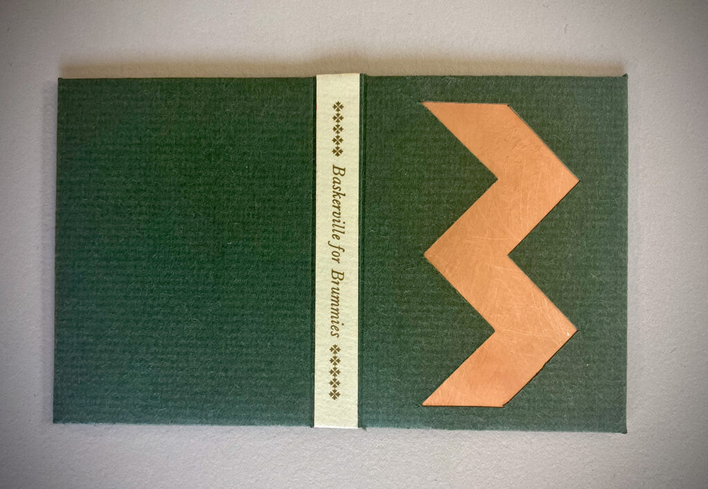
And finally the spine, printed with 10 pt Baskerville Italic in oil based gold ink on the same Zerkall Frankfurt Cream as the innards, is the finishing touch. Cheers to Birmingham. God bless you all.