All broadsides are sold through Etsy and the Viroqua Public Market.

That house…quote from Lord of the Rings by J.R.R. Tolkien
Limited edition, December 2023
$33
The popular Tolkien quote on hospitality, printed in early December 2023 for the Oxford Fine Press Book Fair.
7.5″ x 14″; the type is hand set in Bruce Roger’s 18 pt. Centaur, with ornamental pineapple header and footer, printed in two passes, one being a horizontal color fade, on Zerkall Frankfurt Cream. Limited edition of 23 copies, signed and numbered.

Desiderata by Max Ehrmann
First edition, February 2023
$28
Written in the 1920s by Max Ehrmann, the Desiderata has been slightly edited, designed, printed, and published thousands of times over, and for good reason. The copyright for this beautiful and inspirational prose has been fumbled, and now exists freely as a “gift” to the world. This is the Heavy Duty Press version.
7.5″ x 14″; the type is hand set in original ATF Century Oldstyle, with the title set in rare 16 pt Elysian (cast by The Dale Guild shortly before its demise), and two ornamental rules, printed on Frankfurt Cream from the recently defunct Zerkall paper mill in black ink. First edition of 123 copies, signed and numbered.
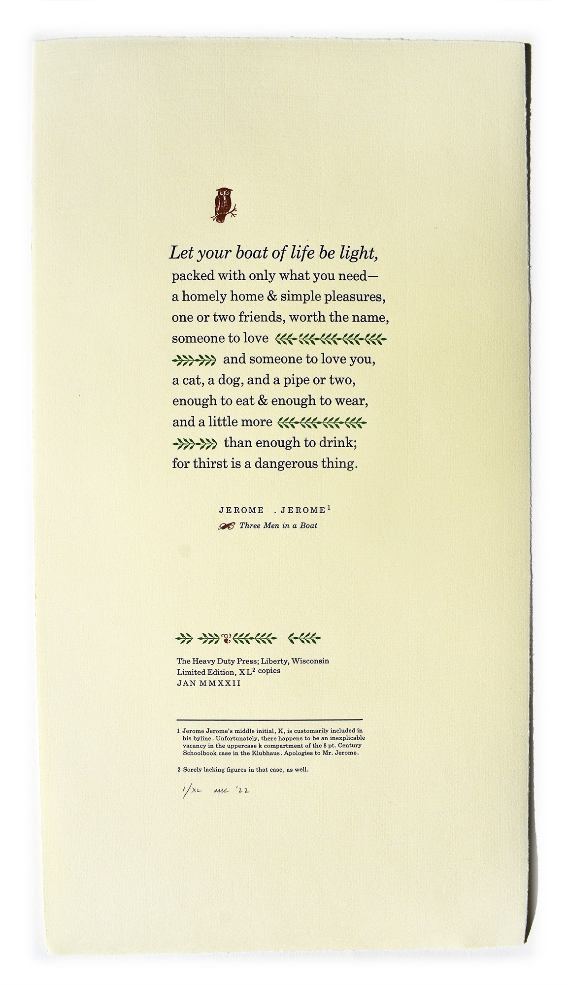
Quotation from Three Men in a Boat by Jerome K. Jerome
Limited edition, February 2022
$33
Many years ago, I had a strange and vivid dream, which of course I cannot remember now. What I can remember is that I immediately went to my computer and started to search specific things from the dream that seemed important, and I ultimately landed on Three Men in a Boat (To Say Nothing of the Dog), by Jerome K. Jerome. I bought a vintage copy of the book and it became one of the first books to be read serially, with a Wisconsinite’s version of the English accent, live on the radio.
When it came time to think of something appropriate to print for The Oxford Fine Press Book Fair, it seemed fitting to use a quote from the book, as it is set on the River Thames near Oxford. To my delight, three copies of the print were sold at the fair, one gentleman remarked that it was a favorite book of his Oxford colleagues, and the print earned the prize for “Best Single Sheet or Piece of Ephemera” at the Fair in 2022.
7.5″ x 14″; the type is hand set in original ATF Century Schoolbook, with ornamental border sorts, two fleurons, and a wise old owl, printed in three passes on Zerkall Frankfurt Cream with black, green, and brown ink.
Edition of 40 copies, signed and numbered.
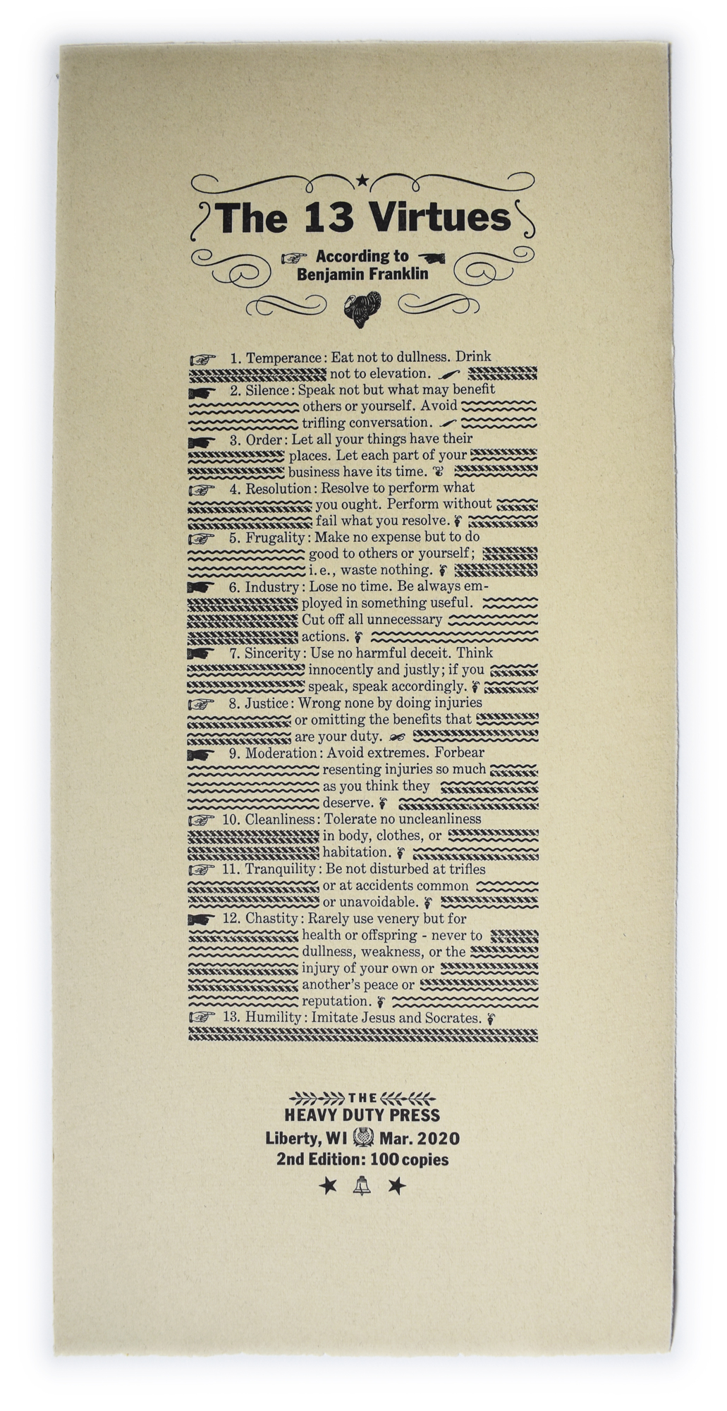
The 13 Virtues According to Benjamin Franklin
Second edition, March 2020
$28
As the inventory of the popular first edition has dwindled, it became time for the first reprint of anything ever from The Heavy Duty Press. This edition is on Zerkall Nideggan, very slightly redesigned, and quite honestly, printed better than the first edition 20 years ago. Experience!
7.5″ x 16″; the type is hand set in original ATF Century Expanded and Franklin Gothic, with an assortment of fists, acorns, rules, and other ornamental sorts. Edition of 100 copies, signed and numbered.

Nature Quote from Charles Dickens
First edition, March 2020
$28
This print was strategically created to sell at the Oxford Fine Press Book Fair at the end of March 2020, which never happened thanks to the virus. Regardless, it’s nice to have something in the catalog honoring Mr. Dickens, and especially something thematically aligned with the Declaration of Orientation.
7.5″ x 14″; the type is hand set in original ATF Century Schoolbook, with favorite ornamental border sorts, printed on Zerkall Frankfurt Cream. Edition of 40 copies, signed and numbered.
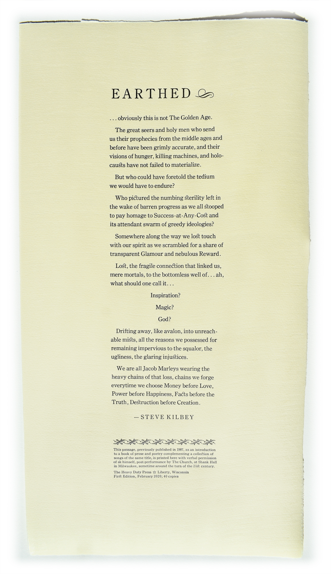
Earthed by Steve Kilbey
First edition, February 2020
$28
This text was set in nearly 20 years ago in the former St. Francis shop, after receiving verbal permission from Mr. Kilbey after a concert by The Church at Shank Hall in Milwaukee. The text is the introductory prose in a companion booklet of poetry for a collection of instrumental musical pieces by the same artist, of the same title, published in 1987.
7.5 x 14″; the type is hand set in ATF Century Oldstyle, with decorative ornamental border sorts, printed on Zerkall Franfurt Cream. Edition of 40 copies, signed and numbered.
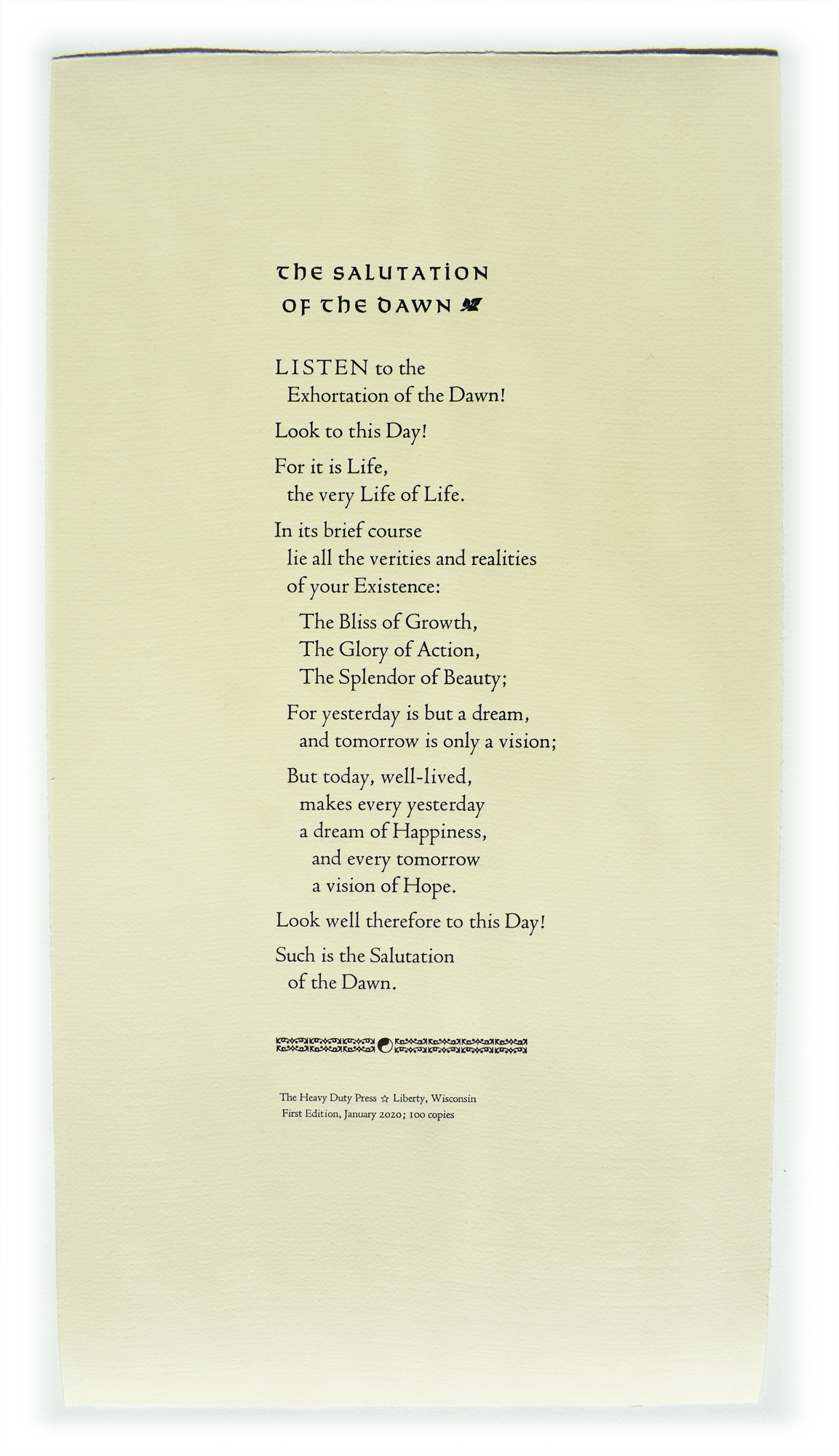
The Salutation of the Dawn
First edition, January 2020
$28
First heard recited by Paul Kaye as Kenny Marsh on an episode of the British television series Two Thousand Acres of Sky. Always felt it was an obvious choice of text for a broadside from The Heavy Duty Press. Took a long time to get around to printing it.
7.5 x 14″; the type is hand set in Bruce Rogers’s elegant Centaur, with the title set in rare 16 pt Solemnis cast by Theo Rehak at the Dale Guild in the late 20th Century, and decorative ornamental border sorts, printed on Zerkall Franfurt Cream. Edition of 100 copies, signed and numbered.

The Declaration of Orientation
Tactile Impression Edition
6″ x 16″; the type is hand set in Century Expanded, with a header in Bank Script.
Contact Michael Koppa to request a copy.
On 10 February 2017, two versions of the Declaration of Orientation were printed to announce the relocation and revival of The Heavy Duty Press’s letterpress shop in Liberty, Wisconsin. The print shown above is from a limited edition of 40, with tactile impression on 300 gsm Hahnemuhle Copperplate 100% alpha cellulose acid free paper. Copies from this edition were mailed to a personal list of special collections librarians.
Seems slightly narcissistic to think someone might actually believe purchasing a copy of this would be a wise investment, or even consider it worthy of inclusion in any collection, for that matter, but a fellow has to believe in himself, if only just for the fun of it. 5 copies remain for sale to serious collectors only.
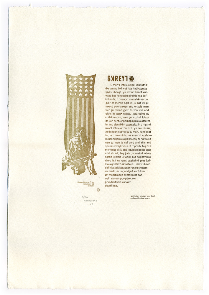
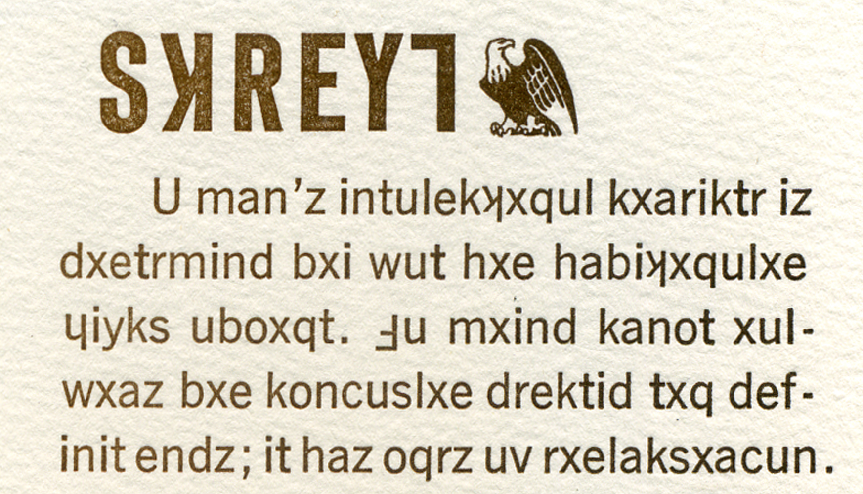
STRENGTH
$54
Signed edition of 30 prints on cotton rag paper
15.5″ x 10.5″
The borrowed text on this print is set in Earthish, a Midwestern English dialect-reading phonetic alphabet developed within the editorial pages of The Sphere in the early 1990s. The alphabet was subsequently refined and the rules finalized in the private journals of Mike Koppa. This is the first time the alphabet appeared in print (2003), and as of 15 November 2016, it remains the only time.
The alphabet was designed, from the beginning, to use only existing characters in order to be used with existing hand set type. This broadside is set in (mostly) ATF News Gothic, with Century Old Style characters when it became necessary.
A very short summary of the basic rules of Earthish
Vowels have only two sounds, long and short, and the q has become an additional 6th vowel to cover the 2 “oo” sounds. Each vowel has a default “short” sound and a “long” sound, which is indicated by a preceding silent x. This is the only use for the letter x: a silent indicator of a long vowel sound. The x is the only modifier of a vowel sound.
There are no contractions. The ch sound, for example, is represented by an upside-down K. The C, which is unnecessary as a representative of either the K or S sounds, represents the sh sound. An upside-down F represents the th as in “the.” An upside-down lower-case h represents the th sound as in “think.” There’s a flaw in the system there…an upside-down uppercase H is hard to differentiate from a right-side-up H! (See the official manual [forthcoming?] to learn how this was resolved, or take a good look a the title.)
Y is the ng sound.
The translation, in part:
A man’s intellectual character is determined by what he habitually thinks about. The mind cannot always be consciously directed to definite ends; it has hours of relaxation. There are many hours in the life of the most strenuous and arduous man when the mind goes its own way and thinks its own thoughts. These times of relaxation, when the mind follows its own bent, are perhaps the most fruitful and significant periods in a rich and noble intellectual life. The real nature, the deeper instincts of the man, come out of these moments, as essential refinement and genuine breeding are revealed when the man is off guard and acts and speaks instinctually….
The rest is left as a challenge for anyone interested in finishing.
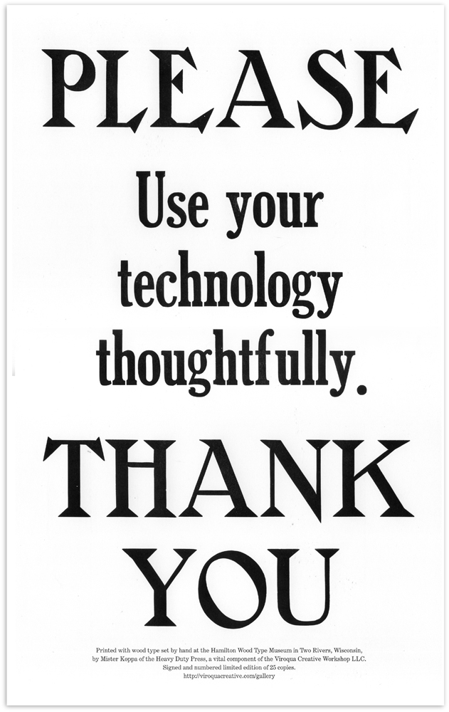
Technology
16″ x 10″ broadside printed from wood type set by hand at the Hamilton Wood Type Museum in Two Rivers, Wisconsin, in 2011. Signed and numbered limited edition of 25 prints.
OUT OF PRINT